These guidelines define how Eastern Studios looks and speaks to the world. Following them ensures our brand stays consistent, professional, and recognizable across every platform and surface.
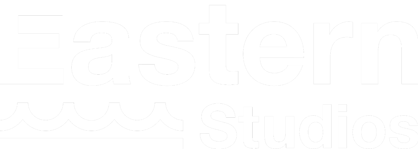
The Eastern Studios logo is available in several approved variations. Always use an official file - never recreate or redraw the logo. Each version is designed for specific backgrounds and contexts.
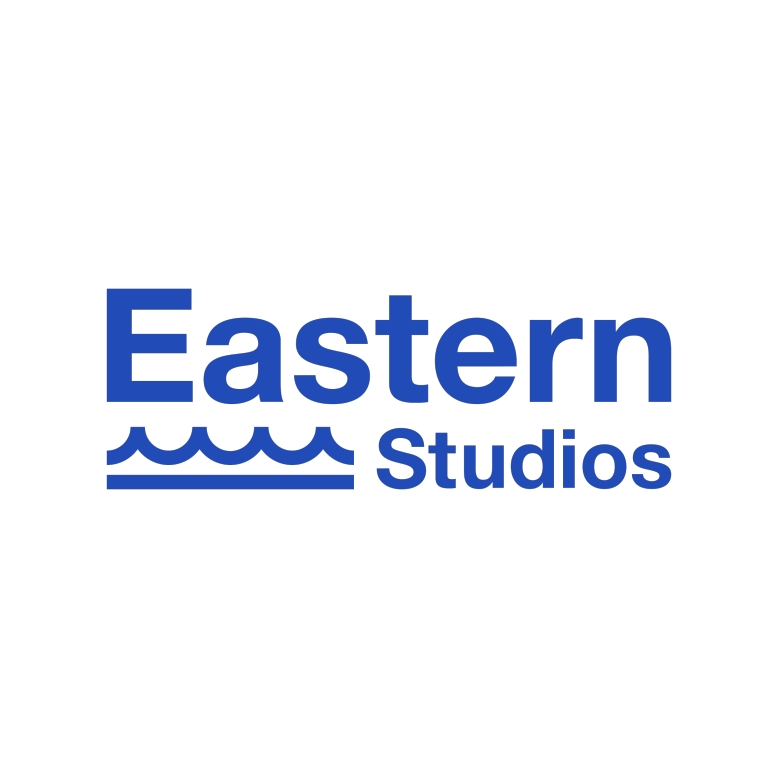
Use on white or light backgrounds
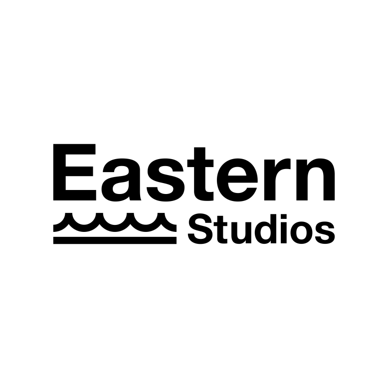
Use on white or very light backgrounds
Use on dark or brand-colored backgrounds
Brand-approved light background treatment
High-contrast dark mode treatment

For large-format print or editorial use
Consistent, correct logo use builds brand trust. The logo must always be forward-facing and fully legible. Never alter its proportions, colors, or orientation.
The logo must always be clearly readable. Ensure sufficient contrast between the logo and its background at all times.
Never recreate, redraw, or modify the logo artwork. Always use an official file from the Eastern Studios brand kit.
Only approved color versions may be used. Do not apply custom colors, gradients, or effects not provided in this guide.
Avoid placing the logo on complex patterns or photos where legibility is compromised. Use a solid or brand-approved background.
Drop shadows, glows, outlines, embossing, or any other effects are not permitted on the Eastern Studios logo.
Never crop, overlap, or obscure any part of the logo. The full mark - wordmark and wave element - must always be visible.
Our palette is built around deep teal, navy blue, clean white, and black - with an accent of aqua that brings energy to digital surfaces. Use these values exactly as specified.
Eastern Teal is always the dominant color. White is used for reversed/dark-background applications. Black and Navy provide depth and contrast. The Aqua Accent is reserved for digital highlights, links, and interactive elements only - never as a primary background.
Eastern Studios uses Montserrat as its primary typeface for headings, navigation, and brand communications, paired with Roboto for body text and supporting copy.
"Eastern Studios crafts compelling visual stories that resonate and inspire - one frame at a time."
"From film production to digital marketing, Eastern Studios delivers multimedia excellence for every project, every time."
How we write our name matters just as much as how the logo looks. Consistent naming across every touchpoint reinforces brand recognition.
Both words capitalized, always written as two words. Never abbreviated in formal communications.
Do not use all lowercase. Both words must begin with a capital letter in all written contexts.
Do not write in all-caps in running text. All-caps usage is only permitted in logo artwork itself.
Use the official social handles in all digital communications. Do not create unofficial accounts.
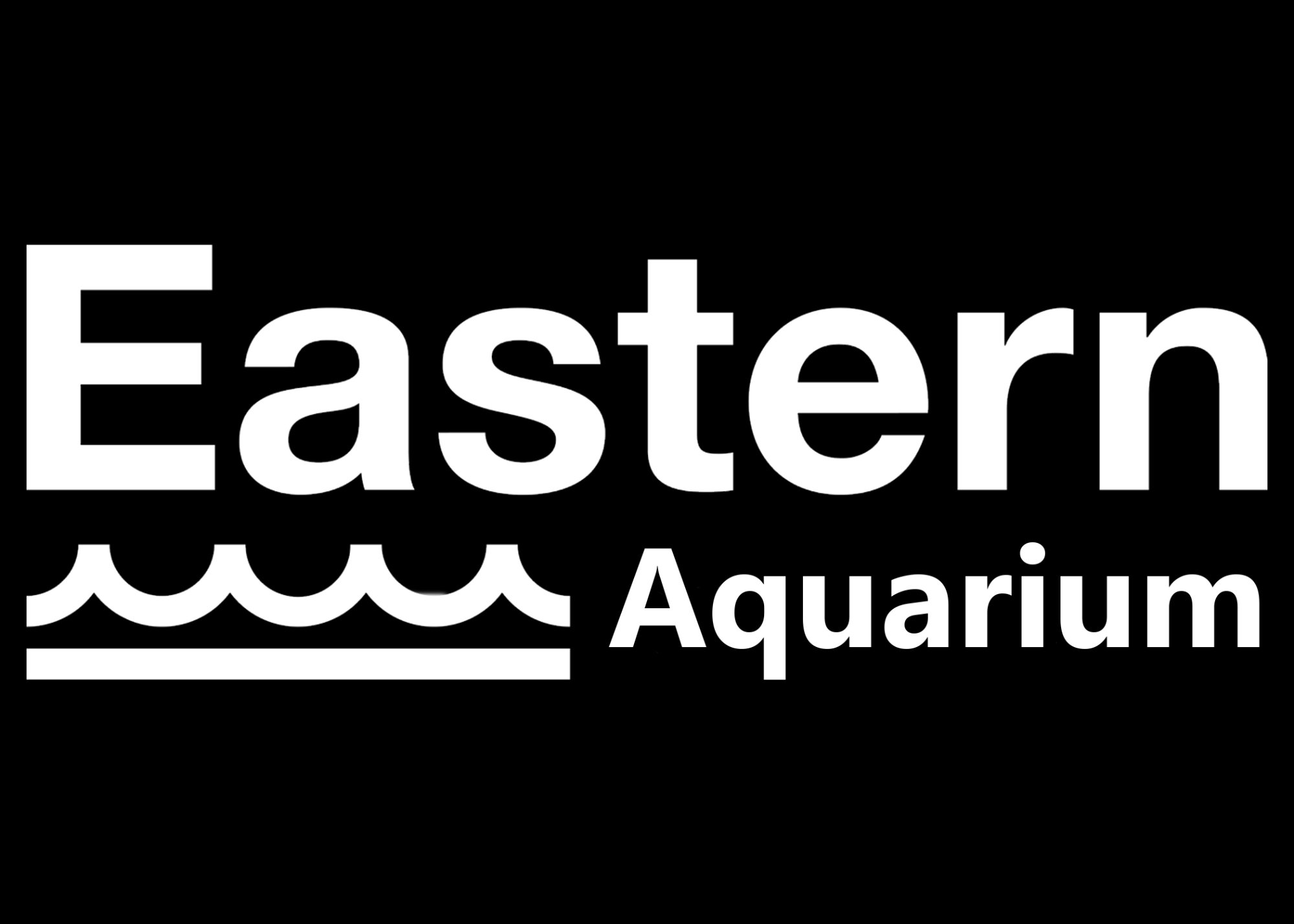
Eastern Aquarium uses the same white wordmark font treatment on dark backgrounds. Logo always presented forward-facing and fully legible - same rules as Eastern Studios apply.
All new sub-brand logos and identities must be reviewed and approved before use. Contact the Eastern Studios brand team to ensure consistency across the family.
Always maintain a minimum clear space around the logo equal to the height of the "E" in Eastern. This ensures the logo is never crowded by other elements.
Official Eastern Studios brand files are available below. Always use the most current versions. If you need a format not listed, contact the brand team.
Contains all approved logo files (PNG, SVG), color swatches, and typography references.
For partnership materials, press kits, or any questions about brand usage, reach out to the Eastern Studios team.
Eastern Studios owns and operates a growing portfolio of brands. Each brand has its own identity, audience, and purpose - unified under the Eastern Studios family.
